


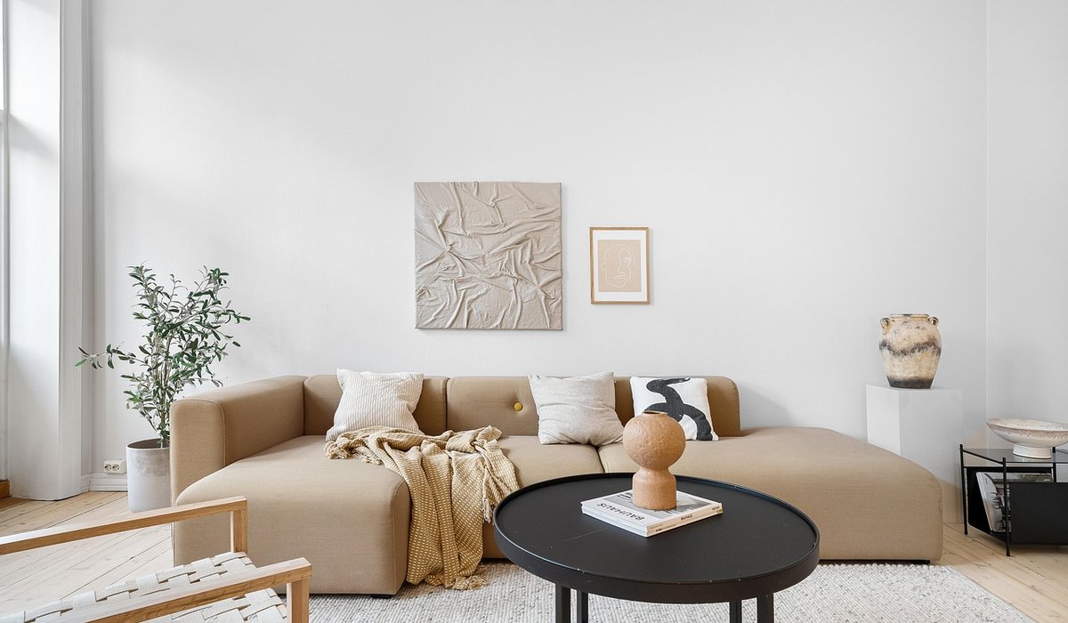
Why Indigo Suits Period Homes
Indigo has a quiet authority that feels entirely at home in older British houses. It is not a shouty colour. Instead, it sits somewhere between blue, grey and black, with a depth that seems to absorb the history of a room rather than compete with it. In Georgian, Victorian and Edwardian homes, deep blues were often used in small spaces, studies, dining rooms and hallways, partly because they flatter candlelight and lamplight and partly because they make timber and brass look richer. True indigo also carries subtle green or violet undertones, which stop it from reading as a flat modern navy. The result is a shade that feels historic without being theatrical. The trick is to choose the right indigo for your room’s natural light and architectural details, not simply the one you liked in a magazine.
Read the Light Before You Commit
Light is the single biggest factor in how indigo behaves. Period homes often have smaller windows, deeper reveals, surrounding trees or neighbouring buildings, so rooms can be darker than they first appear. A north-facing room rarely receives direct sun; here, a mid-tone indigo with a touch of grey or green can feel atmospheric and cocooning, while an inky indigo may turn almost black after dusk. South-facing rooms can take a richer, more saturated indigo because the warm light lifts it. East-facing rooms suit soft, muted indigos that catch the morning sun without becoming heavy by afternoon. West-facing rooms benefit from a slightly warmer indigo with a hint of red or violet, which balances the cooler evening light.
- North-facing: choose an indigo with green or grey undertones; avoid anything too blackened.
- South-facing: you can go deeper and more purple; the light will keep it lively.
- East-facing: keep it soft and slightly dusty so it does not overwhelm the room.
- West-facing: look for warmth in the mix, such as a touch of red or violet.
Match the Shade to Original Features
Original features are your best guide. Look closely at cornices, ceiling roses, picture rails, dado rails, panelling, shutters, floorboards and fireplaces. Indigo can either frame these details or let them recede. In a room with elaborate plasterwork, keep the walls quieter and use indigo on joinery, below the dado, or inside alcoves. In a panelled room, indigo can unify the space and make the panelling feel intentional rather than busy. If you have original shutters, painting them indigo on the inside can make a small room feel considered and cosy. The age of the house matters too: Georgian rooms often suit cooler, greyed indigos; Victorian and Edwardian rooms can take warmer, slightly green or violet indigos; Arts and Crafts spaces welcome earthy, muted indigos that sit well with oak and brick.
Understand Undertones and Pigment
Indigo is not one colour. It ranges from soft, woad-like blues to deep, almost blackened tones. Modern pigments can be very stable, but the undertone is what you notice on the wall. Green-based indigos feel calmer and more rural. Violet-based indigos feel more formal and evening-like. Grey-based indigos are the easiest to live with in smaller rooms. Hold your samples against white paper, then against your existing floor, fireplace and any fixed textiles. If your room has a lot of red brick or orange pine, a green-based indigo will balance it. If you have cool grey stone or marble, a violet indigo adds warmth. Always check artificial light, too: warm bulbs soften indigo, while cool bulbs make it look sharper and more modern.
Test Properly and Prepare the Walls
Never choose an indigo from a tiny swatch. Paint A2-sized samples, ideally on two different walls, and move them around during the day. Observe them in morning light, midday light and lamplight. In period homes, walls are rarely perfectly flat, so finish matters. A dead-flat or matt finish will hide minor imperfections and give that soft, historic look. Eggshell or satin is better for skirting boards, doors and shutters because it is more durable and easier to wipe clean. For lime plaster, use a breathable paint so the wall can manage moisture. Preparation is everything: fill cracks, sand back glossy surfaces, and prime stained or dark areas with a suitable blocker. Deep indigo often needs three coats for even coverage, so allow proper drying time between each one. Do not paint over damp or unstable plaster, as the colour will not cure evenly.
- Walls: dead-flat or matt for an authentic period feel.
- Woodwork: eggshell or satin for durability and a subtle sheen.
- Preparation: clean, fill, sand and prime before you open the indigo.
- Touch-ups: keep a small pot of your chosen colour for later repairs.
Coordinate with Heritage Colours and Finishing Touches
Indigo rarely works alone. It comes alive beside off-white, stone, ochre, copper, brass and aged wood. Avoid brilliant white, which can make indigo look cold and flat. Instead, choose a soft off-white or a warm neutral for ceilings and trim. If you want a lighter scheme, use indigo below the dado rail and a warm neutral above. If you want drama, colour-drench the room, painting walls, woodwork and even the ceiling in related indigo tones. In a hallway, indigo on staircase panelling creates a strong first impression. In a dining room, indigo behind a dresser makes china and glass glow. In a bedroom, an indigo headboard wall feels restful without being gloomy. Add brass hardware, linen curtains and wool textiles to soften the scheme. Finally, live with your samples for a few days. The right indigo should feel as though it has always been there.


Leave a reply